0.5px边框
我们都知道可以通过 CSS 的 border 属性来定义边框,但是我们经常有定义 0.5px 边框的需求,那么是不是只要将 border-width 属性设置成 0.5px就可以了呢?答案当然是不可以的,因为 0.5px 的边框在不同浏览器上的效果不同,有点的浏览器会自动转换成 1px的宽度,那么今天我们要聊的就是有多少种兼容的定义 0.5px边框的方法。
整篇文章的
DOM结构如下:
<div class="border"></div>
# 单边框
首先我们来看如何定义一条边的边框
# border + border-image + linear-gradient
.border {
  width: 200px;
  height: 200px;
  background-color: red;
  margin: 0 auto;
  border-bottom: 1px solid blue;
}
2
3
4
5
6
7
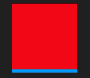
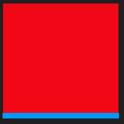
上面的代码定义了一个 200*200 的盒子,背景颜色设置成了红色,并添加了 1px的底部边框,如下图所示:
为了让大家了解实现方法的原理,看的更清楚,图片上的边框宽度都放大了 10 倍。
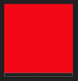
如果我们此时把边框的颜色改成透明色
...
border-bottom: 1px solid transparent;
...
2
3
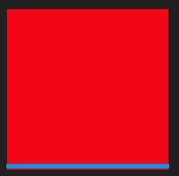
效果如下:
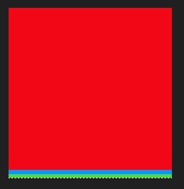
那么,设置成透明色之后,我们使用什么来填充边框呢?那么就要用到border-image属性了
border-image: linear-gradient(to bottom, blue 50%, green 50%) 0 0 100% 0;
使用border-image设置一个由上到下的渐变,蓝色和绿色分别占边框高度的 50%,也就是 0.5px,效果如下:
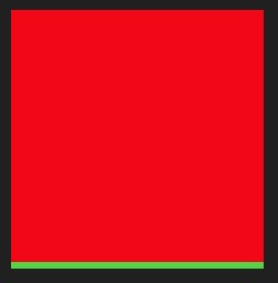
那么,此时我们只需要保留 0.5px,将另一种颜色设置成透明色,就可以实现 0.5px边框的效果了。
border-image: linear-gradient(to bottom, transparent 50%, green 50%) 0 0 100% 0;
最终效果如图所示:
# 定位 + 伪元素 + background-image
.border {
  width: 200px;
  height: 200px;
  background-color: red;
  margin: 0 auto;
  position: relative;
}
2
3
4
5
6
7
首先,一开始的样式大致相同,不同的是我们添加了相对定位,接下来要实现边框,我们不通过边框属性,而是通过伪元素来实现。
... .border::before {
  content: " ";
  position: absolute;
  left: 0;
  bottom: 0;
  width: 100%;
  height: 1px;
  background-color: blue;
}
2
3
4
5
6
7
8
9
可以看到,我们定义了宽度 100%,高度 1px的蓝色背景的伪元素,并将bottom设置为 0,来模拟底部边框。效果如下:
接下来,我们去除伪元素的背景颜色属性,使用background-image来代替,和上面一样,这个属性可以使用 linera-gradient 来实现渐变。所以剩下的思路便和上面一种方式一样了。
...
background-image: linear-gradient(to bottom, transparent 50%, green 50%);
...
2
3
同样也可以实现对应的效果:
# 定位 + 伪元素 + transfrom缩放scale
初始CSS和上面的一样
.border {
  width: 200px;
  height: 200px;
  background-color: red;
  margin: 0 auto;
  position: relative;
}
.border::after {
  content: " ";
  position: absolute;
  left: 0;
  bottom: 0px;
  width: 100%;
  height: 1px;
  background: blue;
}
2
3
4
5
6
7
8
9
10
11
12
13
14
15
16
不一样的是,这次我们不通过background-image来实现了,而是通过transform: scaleY(0.5);来在竖直方向上进行缩放,从而实现 0.5px的边框
...
transform: scaleY(0.5);
...
2
3
结果如下:
由于缩放是从中间向两边进行缩放的,所以最终边框并不是和元素底部对齐的
# 多边框
上面说了单边框,下面来看一下四周都有边框的情况。
.border {
  width: 200px;
  height: 200px;
  background-color: red;
  margin: 0 auto;
  position: relative;
}
.border::before {
  content: " ";
  position: absolute;
  top: 0;
  left: 0;
  width: 200%;
  height: 200%;
  border: 1px solid blue;
}
2
3
4
5
6
7
8
9
10
11
12
13
14
15
16
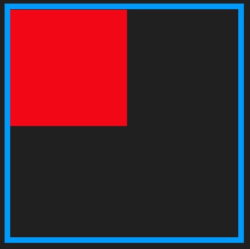
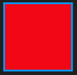
初始 CSS和之前很相似,但在伪元素上有一些不同,伪元素我们定义了 200%的宽高,并且设置了 1px的蓝色边框,如下图所示:
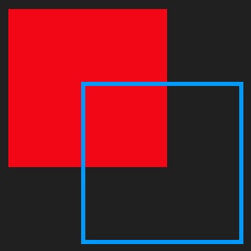
这时伪元素是元素大小的两倍,所以我们只需要将伪元素缩小一半即可
...
transform: scale(0.5);
...
2
3
如下图所示:
我们发现,两个元素并没有重合,这是因为元素变形的原点默认是从中心进行缩放的,如果想以左上角为原点,只需设置:transform-origin: 0 0;即可:
...
transform-origin: 0 0;
...
2
3
最后得到最终的效果:
# 源码
# 单边框
# border + border-image + linear-gradient
.border {
  width: 200px;
  height: 200px;
  background-color: red;
  margin: 0 auto;
  border-bottom: 1px solid transparent;
  border-image: linear-gradient(to bottom, transparent 50%, green 50%) 0 0 100% 0;
}
2
3
4
5
6
7
8
# 定位 + 伪元素 + background-image
.border {
  width: 200px;
  height: 200px;
  background-color: red;
  margin: 0 auto;
  position: relative;
}
.border::before {
  content: " ";
  position: absolute;
  left: 0;
  bottom: 0;
  width: 100%;
  height: 1px;
  background-image: linear-gradient(to bottom, transparent 50%, green 50%);
}
2
3
4
5
6
7
8
9
10
11
12
13
14
15
16
# 定位 + 伪元素 + transfrom缩放scale
.border {
  width: 200px;
  height: 200px;
  background-color: red;
  margin: 0 auto;
  position: relative;
}
.border::after {
  content: " ";
  position: absolute;
  left: 0;
  bottom: 0px;
  width: 100%;
  height: 1px;
  background: blue;
  transform: scaleY(0.5);
}
2
3
4
5
6
7
8
9
10
11
12
13
14
15
16
17
# 多边框
.border {
  width: 200px;
  height: 200px;
  background-color: red;
  margin: 0 auto;
  position: relative;
}
.border::before {
  content: " ";
  position: absolute;
  top: 0;
  left: 0;
  width: 200%;
  height: 200%;
  border: 1px solid blue;
  transform-origin: 0 0;
  transform: scale(0.5);
}
2
3
4
5
6
7
8
9
10
11
12
13
14
15
16
17
18